Fiscozen helps over 3 million Italians manage their VAT number online. But the onboarding spoke in legalese - walls of legal text, unexplained checkboxes, the constant fear of getting something wrong. 80% of users had no prior experience and felt overwhelmed. Our reframe in a 72-hour challenge: stop designing a form, start relieving the emotional load.
Partner
Fiscozen is a tech company on a clear mission: help millions of Italians manage their VAT number (Partita IVA) entirely online. It's a genuinely hard problem - Italian bureaucracy is dense, intimidating, and emotionally heavy for the people navigating it for the first time.
Talent Garden ran a challenge: five teams, 72 hours, one brief - redesign the Fiscozen onboarding. Friday to Monday. At the end, Fiscozen's own Product Manager would evaluate every team and pick a winner based on the strength of the solution.
We won. This is the story of how - and specifically, the contribution I held onto from the first hour to the final pitch.
My role in the team of five: I led on UX research, UX writing, and the design system work, and I co-delivered the pitch. But my most important contribution wasn't a deliverable - it was a single framing idea I introduced early and defended all the way to the end: relieve the emotional load. It became the lens every decision passed through.
// The brief - three asks
New Design System
Fiscozen was migrating to a Tailwind-based design system. The redesign had to work within that new component foundation.
Better Conversion
Rethink the onboarding flow with new conversion models - reduce the drop-off happening across the funnel.
Kill the Legalese
The funnel spoke too much in "legalese". It had to be simplified into language real users could actually understand.
The brief asked us to think beyond the existing "User Wizard" and look at the whole experience - from the first sales call to the first moments inside the app. So we put ourselves in the shoes of the actual user: someone opening a VAT number, often for the first time, with no fiscal background.
What we found wasn't a usability problem. It was an emotional one. Users didn't understand what was happening to them during onboarding. They hit pages full of legal terms and walls of contract text, and - with no experience to lean on - they got scared.
The worst moments were the checkboxes and signatures. That's where users felt most abandoned: alone in front of a legal commitment, anxious they were about to make a mistake they couldn't undo.
No sense of what's happening - users couldn't tell where they were in the process or why each step was needed
80% had no experience - the vast majority of the userbase was scared by legalese pages and walls of contract text
Abandoned at the hardest moments - checkboxes and signatures triggered the anxiety of getting something wrong, with no reassurance
The real insight: the onboarding wasn't too long or too complex to use. It was too heavy to feel. The problem to solve was emotional, not functional.
With only 72 hours, research had to be fast and sharp. We had no access to Fiscozen's internal analytics, so we took our own screenshots of the existing onboarding and analysed it directly, alongside market and user research.
01
Competitive Benchmark
Analysis of how the existing Fiscozen funnel worked screen by screen, plus how the alternatives - traditional accountants and other digital fiscal services - handled first contact. The pattern: everyone treated onboarding as paperwork, never as reassurance.
02
Desk Research
Understanding Fiscozen's market and the real fiscal constraints involved - what legal steps genuinely couldn't be removed, so we could focus our energy on how they were framed, not whether they existed.
03
User Interviews
5 interviews with the target profile: freelancers and young people opening their first VAT number. These conversations surfaced the emotional weight that became the core of our solution.
Users were lost in their own onboarding
People couldn't tell what was happening or what was being asked of them. The lack of orientation was a constant low-level stress that built across the funnel.
Legalese scared the 80%
The overwhelming majority of users had no fiscal experience. Legal-heavy pages and dense contract text didn't just confuse them - they frightened them into hesitation.
Commitment moments felt lonely
Ticking checkboxes and signing contracts were the points of maximum anxiety. Users felt abandoned exactly when they needed the most reassurance.
The steps couldn't go - but the feeling could change
Desk research confirmed most legal steps were non-negotiable. We couldn't remove them. But we could completely change how they felt - and that was the whole opportunity.
Relieve the
emotional load
The single framing that turned a bureaucratic form into a reassuring journey - "alleviare il carico emotivo"
Early in the 72 hours, the team was circling the problem. We were looking at the existing Wizard and trying to fix it step by step - patching individual screens without a clear direction. The harder we tried to untangle all those phases, terms, and checkboxes, the more we started to feel exactly what the users felt: overwhelmed.
That was the unlock. I put myself in the position of an ordinary person facing that wall of complexity and named the real problem out loud: we're not confused, we're anxious - and so are they. The job wasn't to simplify a form. It was to relieve the emotional load. I proposed it as our north star, explained the feeling behind it, and the team aligned on it immediately. From that moment, every decision had a clear test: does this make the user feel lighter, or heavier?
Legalese and walls of text presented with no context or translation
Cold, bureaucratic tone that treated the user as a case file
No orientation - users couldn't tell where they were or why
Silence at commitment points, leaving users alone with their anxiety
Human, reassuring language that explains the "why" behind every step
Warm tone of voice that frames bureaucracy as a milestone, not a hurdle
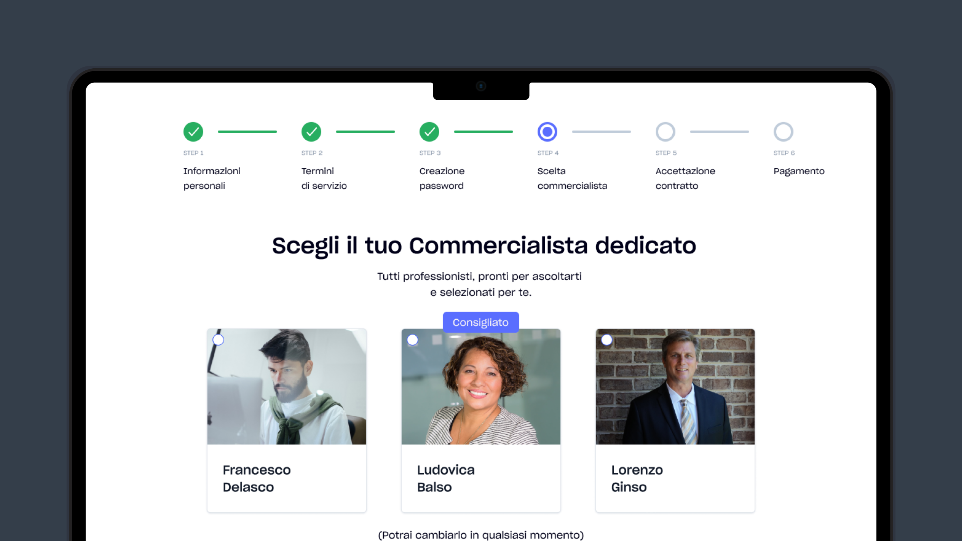
A clear 6-step progress bar so users always know where they stand
Reassurance placed exactly where anxiety peaks - at every choice and signature
With "relieve the emotional load" as the north star, the decisions followed naturally. The biggest lever wasn't visual - it was language. As the team's UX writer, this is where I focused most.
A human tone of voice, everywhere
We rewrote the funnel's language to sound like a person, not a contract. Every screen reframes a bureaucratic step as a step toward the user's own goals. Legalese was replaced with plain, warm, motivating language - without removing a single legally required element.
UX WritingA clear, persistent 6-step progress bar
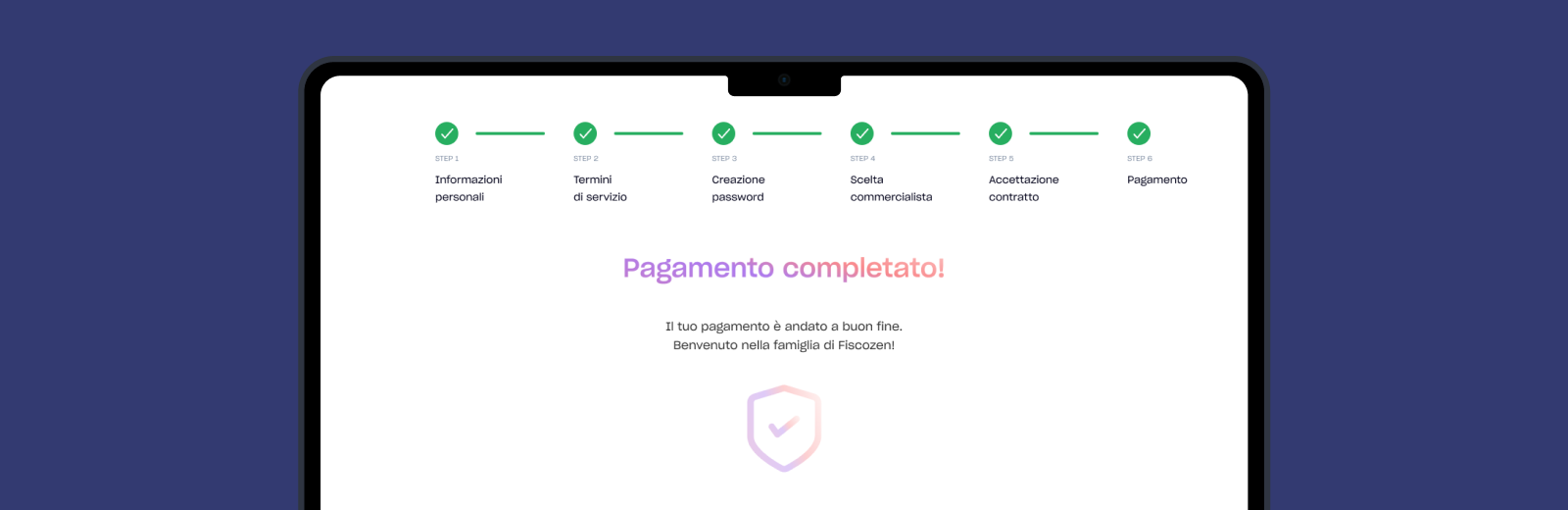
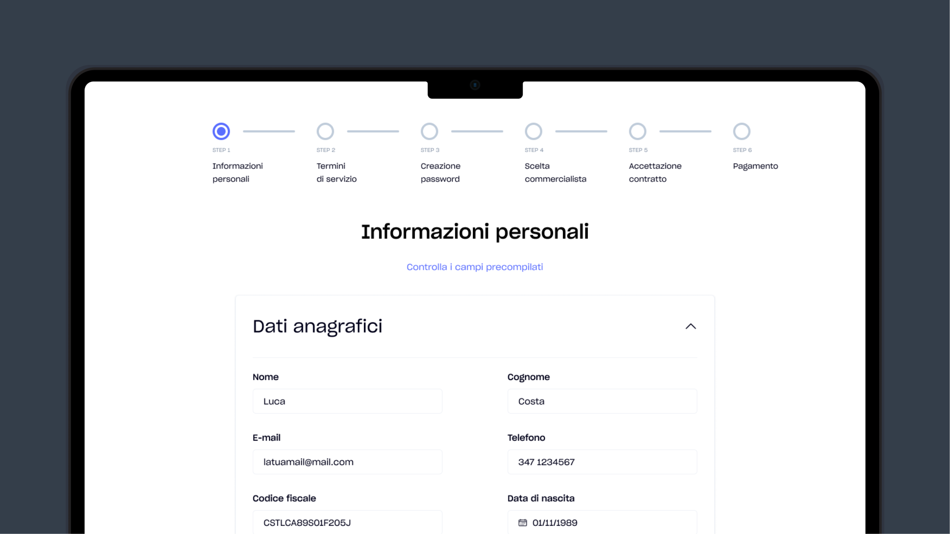
Orientation was a core anxiety. We introduced a visible 6-step progress indicator - Personal info, Terms, Password, Accountant, Contract, Payment - present on every screen. Users always know where they are, how far they've come, and what's left. Uncertainty was the enemy; this killed it.
Information architectureReassurance at the anxiety peaks
We placed reassuring microcopy exactly where users felt most exposed. Choosing an accountant? "You can change them at any time." Signing the contract? Language that frames it as officialising your ambitions, not signing your life away. The fear of irreversible mistakes was defused at the source.
Emotional designBuilt on the new Tailwind design system
The redesign was built directly within Fiscozen's new Tailwind-based component system - one of the explicit brief requirements. This kept the solution realistic and immediately implementable, not just a beautiful but disconnected concept.
Design systemAn 8-screen onboarding that carries the user from first contact to their new dashboard - each step lighter than the original, each moment of doubt met with reassurance. Below, the redesigned flow, with the real microcopy that does the emotional work.
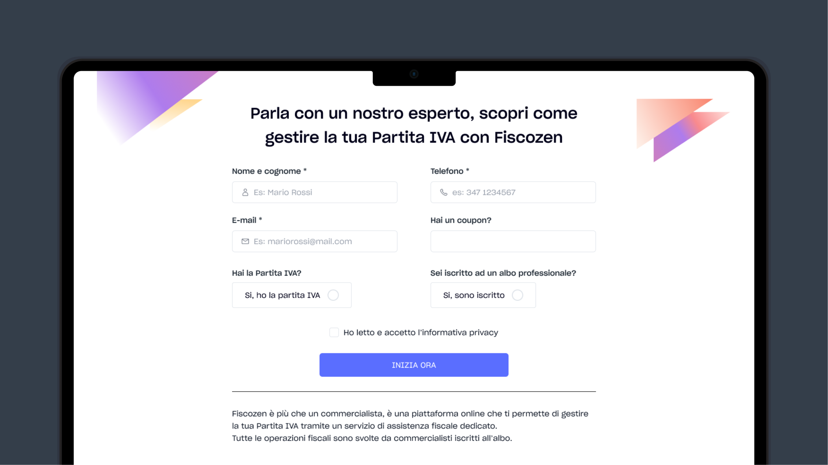
Entry · The Lead FormThe first touchpoint. A short, friendly form to talk to an expert - warm and approachable, setting the tone before any bureaucracy begins.
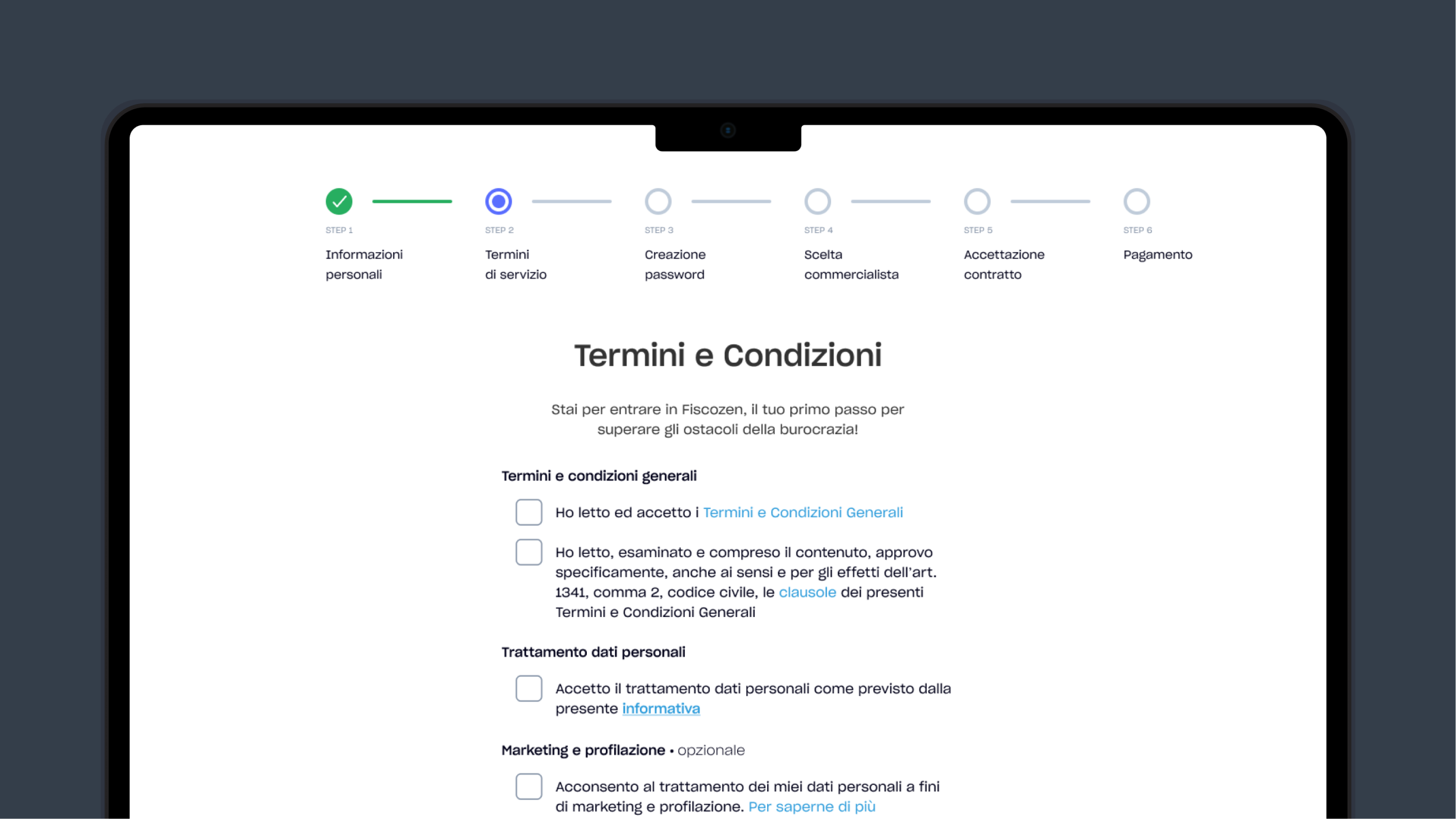
Pre-filled fields reduce effort. The Terms page opens not with legalese but with a line that reframes the whole moment.
"Stai per entrare in Fiscozen, il tuo primo passo per superare gli ostacoli della burocrazia!"
Why it works: a Terms & Conditions page is the coldest moment in any signup. This opening line reframes it as a milestone - the user isn't reading legal text, they're taking their first step past the bureaucracy that intimidated them.
A high-stakes choice made safe. A "Recommended" option removes decision paralysis, and the reassurance sits right under the cards.
"(Potrai cambiarlo in qualsiasi momento)"
Why it works: choosing a dedicated accountant feels permanent and high-stakes. This single parenthetical removes the fear of a wrong, irreversible choice - turning a moment of hesitation into an easy "next".
The account creation confirmation isn't a dry system message. It's a moment of celebration that connects the bureaucratic act back to the user's ambitions.
"Il tuo account è stato creato! È il primo passo per realizzare le tue ambizioni."
Why it works: it transforms a transactional confirmation into an emotional reward. The user doesn't just have an account - they've taken the first concrete step toward their goals. The load lifts.
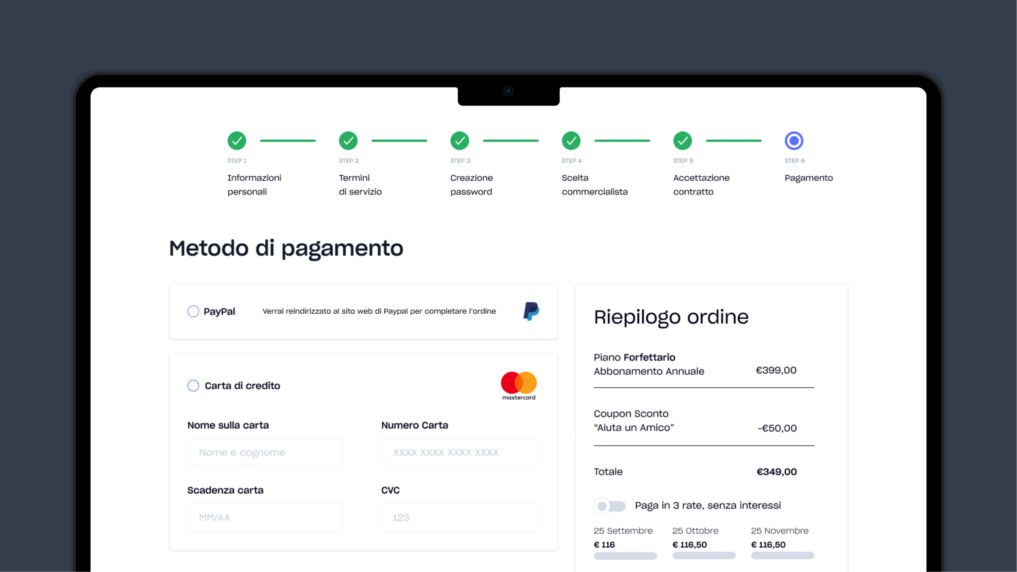
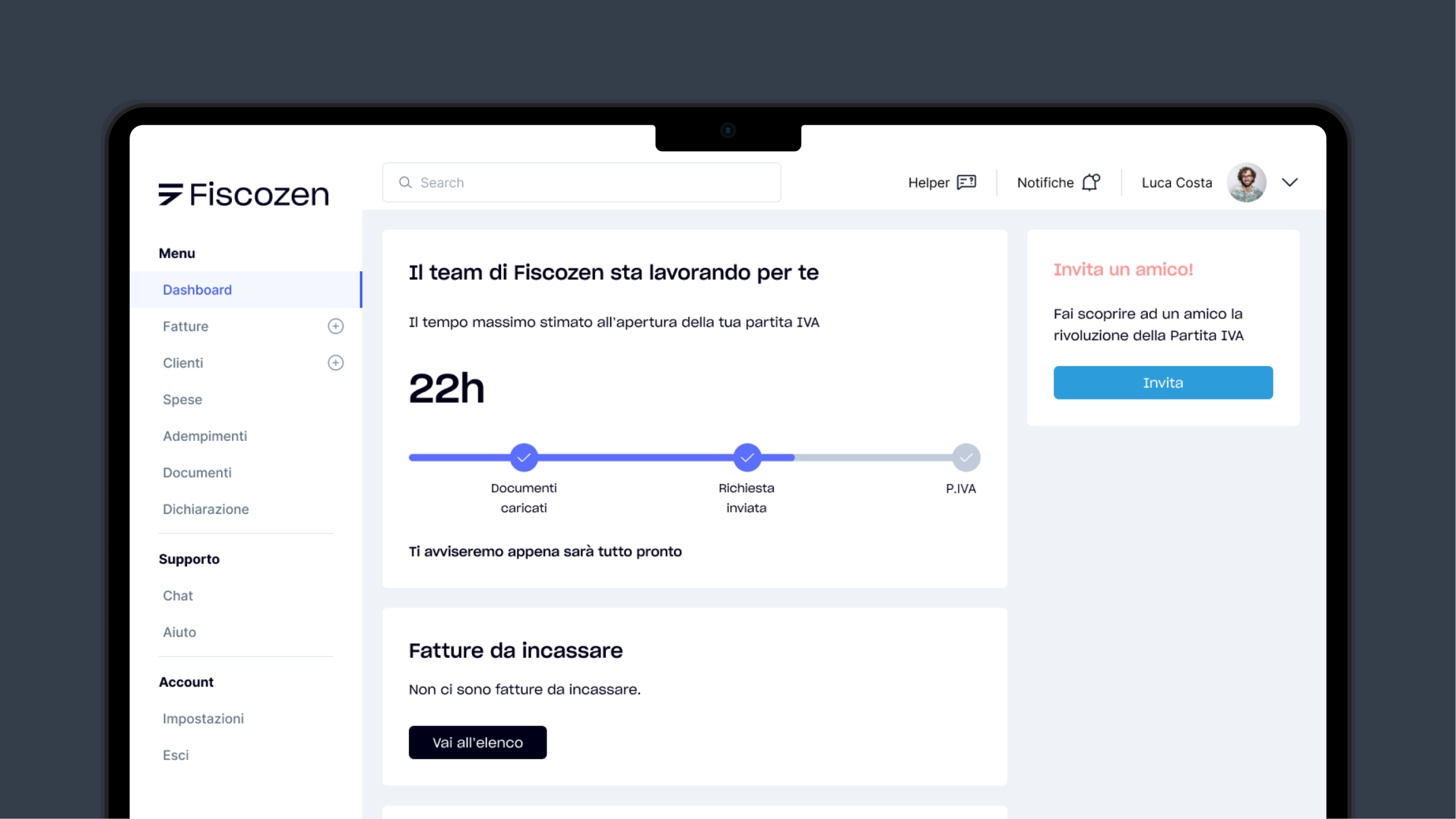
A clear order summary with no hidden surprises, leading into the dashboard where the user finally lands - oriented, reassured, and ready to work.
Fiscozen's Product Manager evaluated all five teams and selected ours. Two things set our work apart: the strength of our research and insights - we'd correctly identified that the real problem was emotional, not functional - and a more polished, more interactive prototype that demonstrated the solution working end to end, not just as static screens.
The win wasn't about prettier visuals. It was about a solution that was genuinely effective and grounded in a real understanding of the user - one clear idea, defended consistently, executed across the whole flow.

To trust my instinct. My strongest contribution wasn't a screen or a deliverable - it was empathy, named and turned into a direction the whole team could follow. I learned that an emotional read of a problem is a real design contribution, not a soft one. With more than 72 hours, the natural next step would have been usability testing the redesigned flow to validate the reframe with real users - but the core idea held, and that's what mattered.
The result, and how we got there. The insights we surfaced were genuinely valid, and the solution was effective - not just on paper. In an extremely short time, with a team I'd just started working with, we found the real problem, agreed on one clear idea, and executed it well enough to win. That's the kind of work I want to keep doing.