Serenis asked us to design a mindfulness section from scratch, inside their mental health app, for young professionals aged 23-30. The research surfaced one truth that shaped everything: for this audience, consistency beats duration. People didn't fail at mindfulness because sessions were too short - they failed because they couldn't keep coming back. So we built for the return, not the session.
Partner
Serenis is an Italian mental health platform. The brief was to design a brand-new mindfulness section from scratch, built directly inside their existing app - not a standalone concept, but a feature that had to live alongside their core therapy experience.
We had four weeks and a team of six. I worked on UX research and UX writing - shaping how we understood the audience, and the voice the final product spoke with. Mindfulness content lives or dies on tone, so the writing wasn't decoration, it was core to whether the feature would feel inviting or preachy.
The target was specific and demanding: young professionals, 23 to 30 - a group with real stress, real burnout, and very little patience for anything that wastes their time.
My contribution beyond research: as UX writer I gave the section a warm, non-judgmental voice - mindfulness that encourages without lecturing. And I helped shape the idea I'm proudest of: the mascot whose flowers grow as you practice, a gamification mechanic inspired by Pikmin that turned consistency into something you could see.
Young
Professionals
Ages 23 to 30. Career-focused, time-poor, and under real pressure. They know they should slow down - they just don't have a tool that fits into a life moving at full speed.
01
Survey
A survey distributed through our own social and LinkedIn channels, reaching a sample of 140 people in the target demographic - quantifying anxiety, mindfulness habits, and the gap between intention and practice.
02
User Interviews
In-depth conversations that surfaced the emotional reality behind the numbers - the lived experience of stress, sleeplessness, and the struggle to build a consistent self-care habit.
03
Desk Research
Market and industry research, including data from global strategy consultancy Bain & Company on burnout among young Italian workers - grounding our audience's experience in wider evidence.
140
People surveyed
9:5
Female to male ratio
23-30
Age range
76%
had suffered from anxiety. Of these, 28% sought psychological support, 14% follow relaxation practices, 28% pursue self-improvement
52%
didn't practice mindfulness - but said they wanted to. The intention was there; the habit wasn't
64%
of under-35 Italian workers show symptoms of burnout, according to Bain & Company
The 52% gap - people who want mindfulness but don't practice it - became the heart of the design problem.
The Anxious Perfectionist
Sets impossibly high standards for herself and internalises every bit of work pressure. She lies awake at night, runs on stress, and knows she should slow down - but feels she simply doesn't have the time for it.
What she needs: permission to rest, and sessions short enough to fit into a day that's already full.
The Comfort-Zone Challenger
Ambitious and always chasing the next challenge. He thrives on growth but pushes himself toward burnout, and finds passive meditation boring - if it doesn't engage him, he won't come back to it.
What he needs: a sense of progress and play - mindfulness that feels active and rewarding, not static.
"I work and I'm always rushing."
"I wake up during the night."
"Too much pressure at work."
It's not session length that builds wellbeing - it's consistency and frequency. People weren't failing because sessions were too long. They were failing because they couldn't keep coming back.
This reframed the entire problem. The default assumption in mindfulness apps is that the session is the product - longer, deeper, more guided. But our research said the opposite: our users wanted short sessions, and what they really struggled with was showing up regularly.
So the design challenge wasn't "make a better meditation." It was "make people want to return tomorrow." Every decision that followed - the structure, the brevity, the mascot - was built to serve consistency over depth. We designed for the habit, not the moment.
offer a tool that helps people build a more positive relationship with life - and learn to live in the present?
We built the mindfulness section around three contexts where our users needed support most - work, sleep, and the moments in between - plus a mascot that made the invisible work of consistency visible.
The Work Section
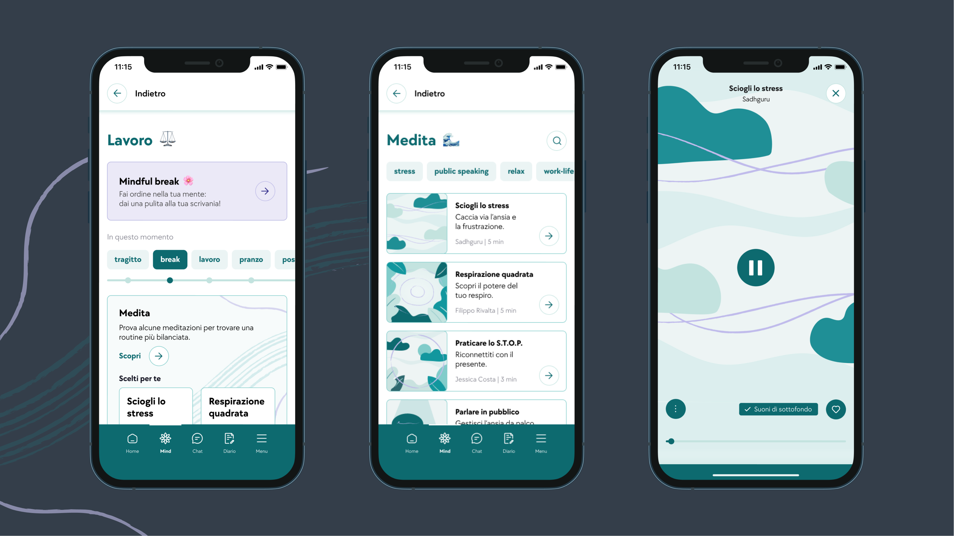
A daily mindfulness hub with a segmented time-of-day bar that recommends the right session for the moment. Three core exercise types to choose from: guided meditations, short exercises, and relaxing sounds. Built for quick, in-the-workday resets.
Daytime mindfulnessThe Sleep Section
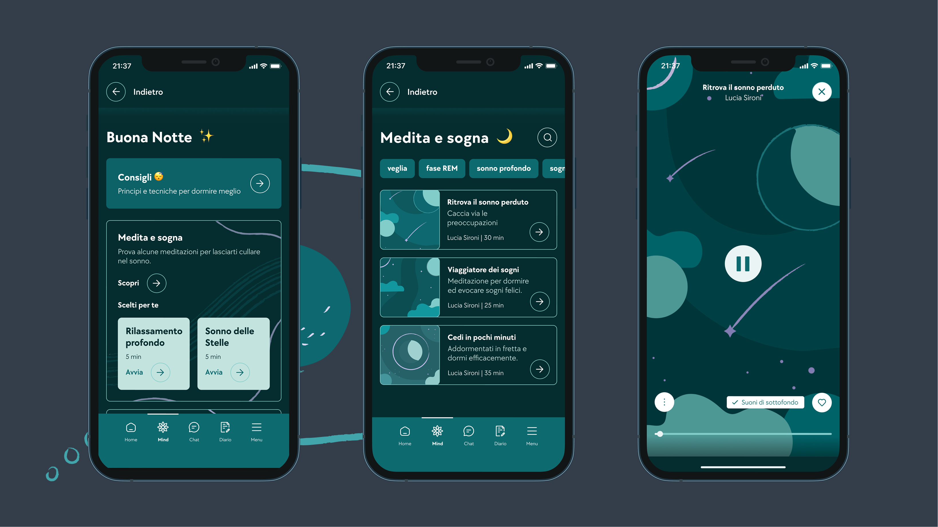
In dark mode to aid focus and wind-down. It opens with principles and techniques for sleeping better, then offers three sleep-focused exercises: meditations, audio stories, and relaxing sounds. A dedicated space for the night, when our personas said they struggled most.
Nighttime mindfulnessThe Mindful Break
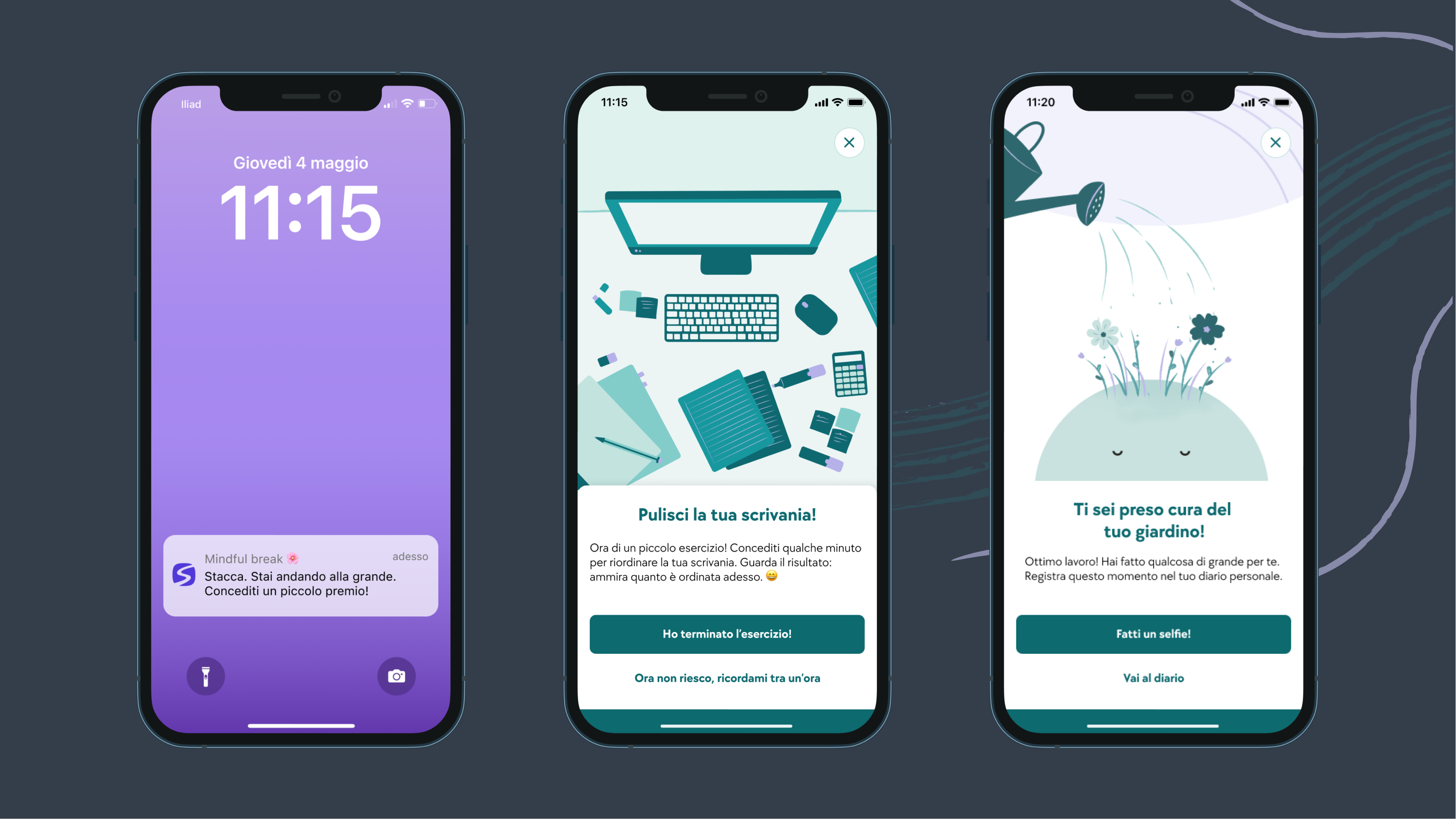
At a random moment during working hours, a notification arrives. It asks the user to step away from work, reconnect with the present, and complete a very short step-by-step exercise. It brings mindfulness to the user instead of waiting to be opened - perfect for an audience that forgets to slow down.
Proactive nudgeThe Mascot - making consistency visible
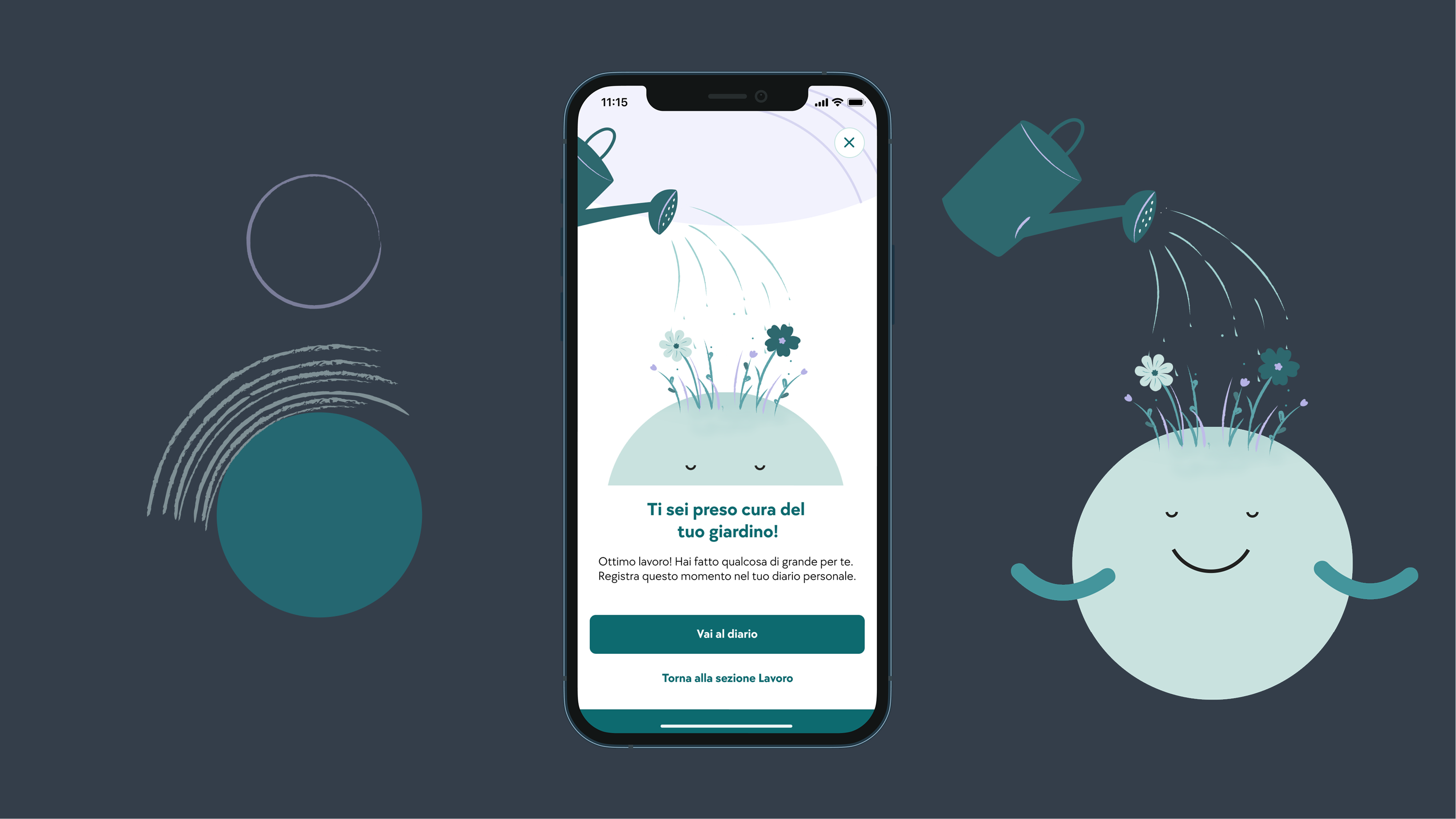
The piece I'm proudest of. A mascot gives users a concrete view of how much they're investing in their mental health: every time you complete a session, flowers grow on the mascot's head. It turns an invisible habit into visible progress, directly rewarding the consistency and frequency our research identified as the real goal. A gamification mechanic inspired by Pikmin.
★ My proudest contributionConsistency was the goal, so we made it the reward. The more you practice, the more the mascot blooms - a small, satisfying signal that your habit is taking root.
✦
Just started
A bare mascot. The first session plants the first seed.
✦ ✦ ✦
Building the habit
Regular sessions grow more flowers. Progress you can see at a glance.
✦ ✦ ✦ ✦ ✦
In full bloom
A consistent practice, made beautifully, visibly tangible.
Daily mindfulness with a time-of-day bar that recommends the most fitting session. Three exercise types: meditations, short exercises, and relaxing sounds.
In dark mode for wind-down. Sleep principles and techniques up top, then three sleep-focused exercises: meditations, audio stories, and relaxing sounds.
Left: the Mindful Break notification and its short step-by-step exercise. Right: the mascot, blooming with flowers as sessions are completed.
The real lesson was about teamwork - finding common ground with six different people so everyone could do their best work, and managing a deadline well even with more time than usual. More time doesn't manage itself. On the design side, I'd have run user testing on the prototype, and spent more time on visual hierarchy and defining the core user flows - the areas where four weeks still wasn't quite enough.
Helping create the mascot's flower system. It's a gamification idea, inspired by Pikmin, that turns an invisible habit into something you can watch grow. It came directly from the research - consistency was the real goal, so we made consistency the thing you could see and feel rewarded for. That link between an insight and a delightful mechanic is exactly the kind of work I love doing.