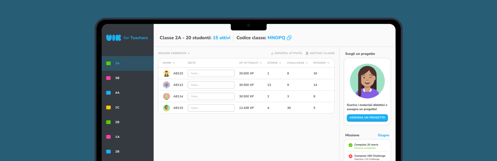
Every week, each school cost the VIK team at least an hour of manual work - pulling data from a database, loading it into Google Sheets, emailing teachers. With dozens of schools and growing, this wasn't a process. It was a liability. The dashboard was built to make that problem disappear.
Partner
The VIK Teacher Dashboard wasn't planned from day one. It emerged as a direct consequence of watching the app ecosystem struggle to scale. While I was still redesigning the student app, a parallel problem was becoming impossible to ignore: teachers had no autonomous way to interact with the platform.
Every action required someone from VIK. A teacher wanted to see how her students were doing? Email VIK. A student forgot their password? Email VIK. A class needed a new project assigned? Email VIK. With each school requiring at least an hour of manual work per week - and dozens of schools on the platform - the model couldn't survive its own growth.
The decision to build the dashboard happened organically: we launched the app, observed the operational cost in real time, and built the tool the ecosystem needed to function without us.
1+ hour per school per week manually managing data requests, password resets, and project assignments via email
No real-time visibility for teachers - data had to be manually exported by a developer and shared via Google Sheets
Zero teacher autonomy - every action, however small, required VIK team intervention
Dozens of schools on the platform, each with 3 classes average and ~22 students each - the problem was compounding fast
01
Behavioral Observation
Before designing anything, we observed teachers using existing digital tools. We catalogued actions, friction points, moments of confusion, and emotional responses - building a real picture of how they interact with technology in a professional context.
02
User Interviews
Three to four structured interviews with teachers across different schools and age groups. Questions focused on their existing workflows, their biggest frustrations with digital tools, and what "easy to use" actually meant to them.
03
Internal Data Analysis
We had months of operational data - which requests came in most often, how long they took, where teachers got stuck. This quantified the problem and shaped the feature priority list.
Complexity was the enemy
Teachers didn't fear technology - they feared making mistakes with it. Every extra step, every ambiguous label, every unclear action was a potential source of anxiety. The design had to eliminate doubt at every touchpoint.
Age changed speed, not capability
Younger teachers moved faster, older teachers more cautiously. But both groups could complete the same tasks - the difference was time, not outcome. This meant the design didn't need to simplify the content, it needed to support different paces.
Teachers scan across classes naturally
When checking one class, teachers almost always wanted to peek at the others too. A sidebar with all classes visible at once wasn't just convenient - it matched their actual mental model of how they manage groups of students.
The ebook problem was invisible - until it wasn't
Teachers frequently forgot which project was currently assigned, forcing them to contact VIK just to get an ebook link. This wasn't a complexity problem - it was a memory problem. The fix was a persistent visual indicator, not a new feature.
One small but telling observation during behavioral research: older teachers often preferred using browser arrow buttons on number input fields rather than typing. Most tools ignored this. We didn't - we implemented custom, larger increment arrows on all numeric inputs. A 10-minute decision that removed a point of friction for a significant portion of our users.
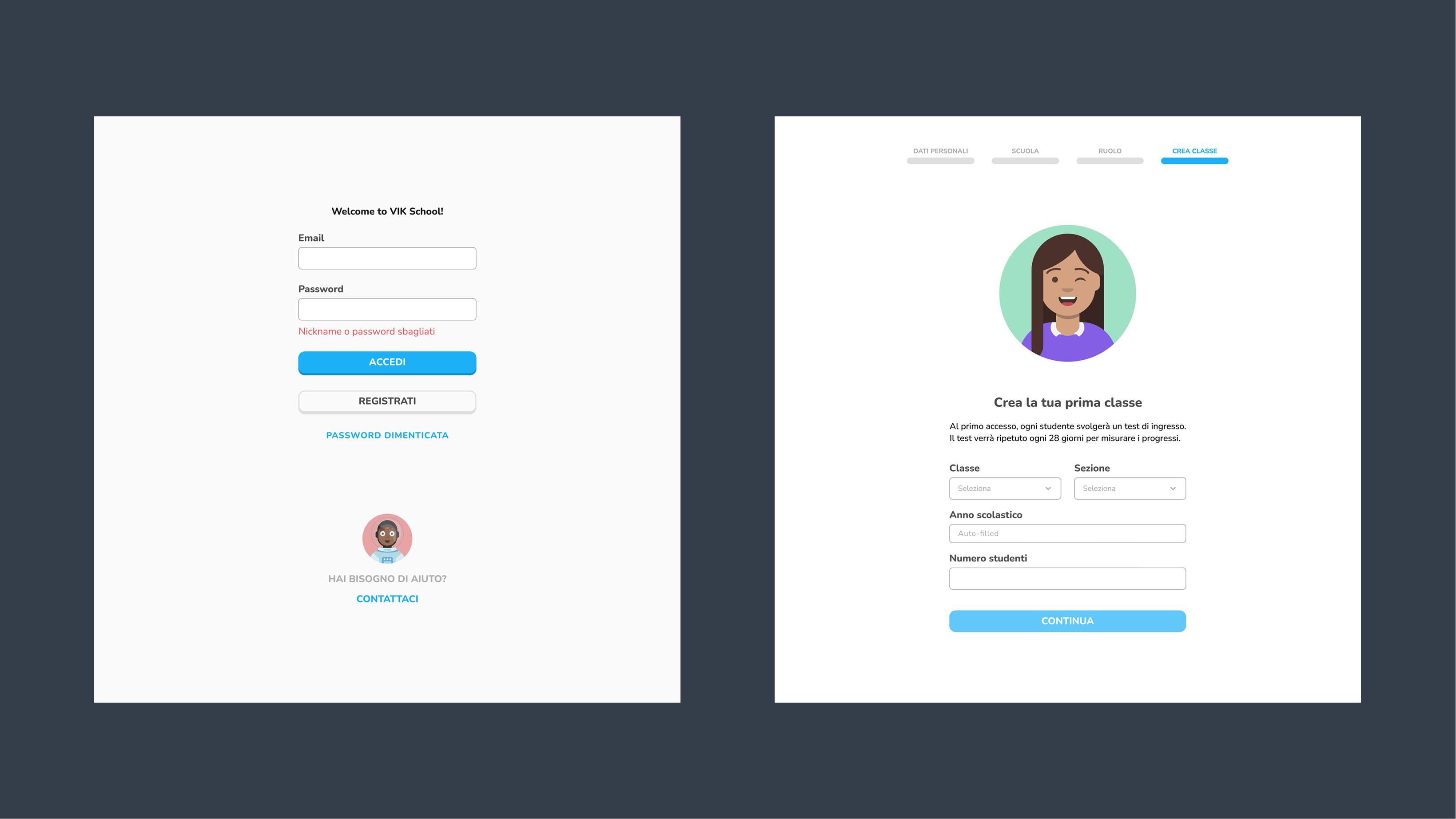
The onboarding had one job: get a teacher from zero to a fully functional classroom in under 2 minutes, without them needing to call anyone. We designed two entry paths depending on whether VIK already had the teacher's data or not.
Independent Setup
For teachers joining without prior contact with VIK. Guided step-by-step - personal info, teaching context, then immediate classroom creation with auto-generated student codes.
Personal info - name, surname, phone, email
Teaching context - subject, role, school
Create first class - number of students
Receive auto-generated student access codes
Dashboard ready - students can join immediately
Pre-loaded Setup
When VIK already has all the necessary information - the teacher receives credentials directly and logs in to a pre-configured dashboard. Zero friction, zero forms.
Teacher receives credentials from VIK
Login - classes and students already configured
Dashboard immediately operational
Step-by-step registration designed for low digital literacy. One primary action per screen, no nested menus, clear progress indication throughout.
Every decision in the dashboard came down to one question: can a teacher who has never used this before figure it out in the first 30 seconds? If the answer was no, we redesigned it.
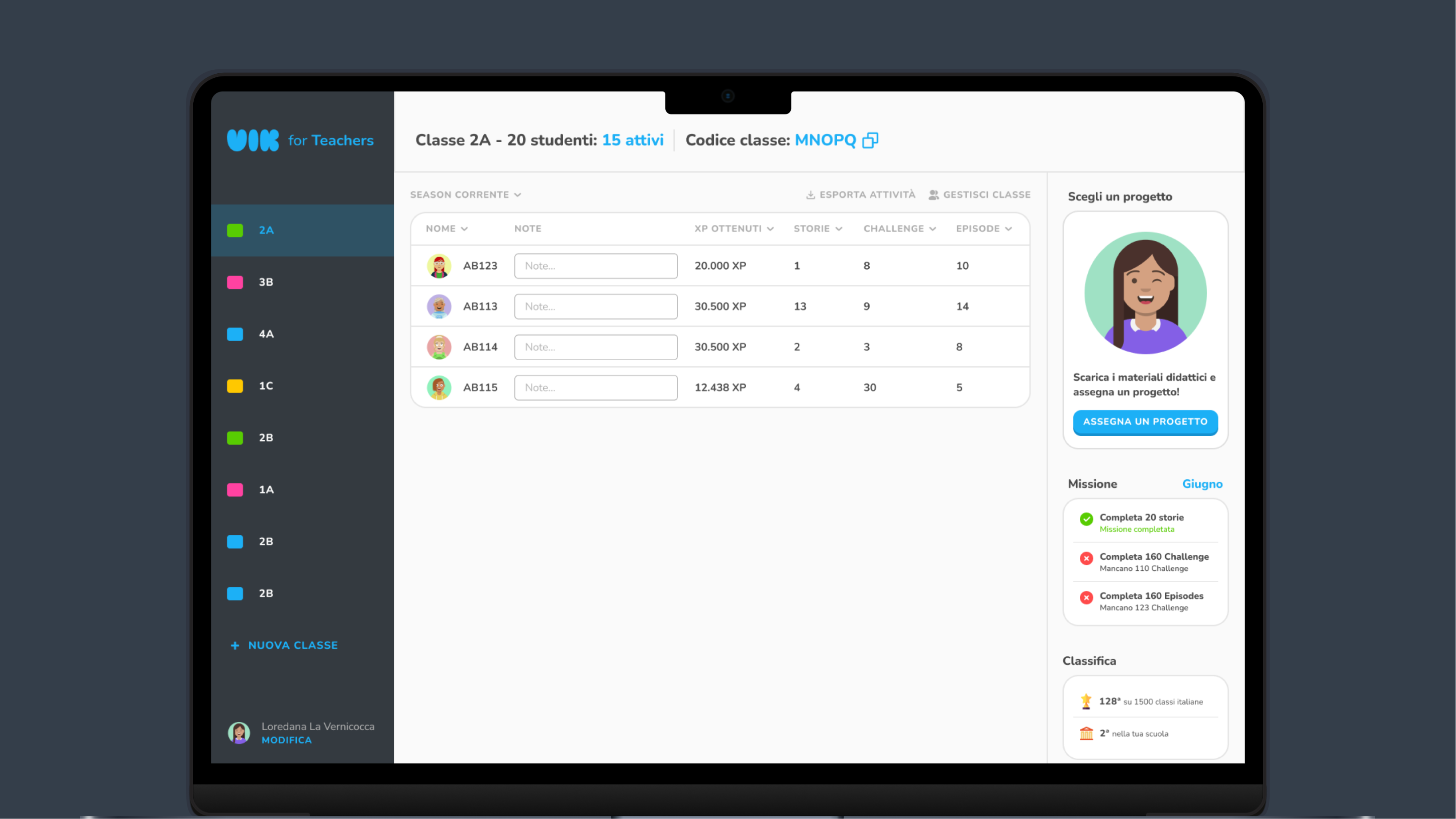
Sidebar navigation - all classes always visible
Research showed teachers naturally check multiple classes in a single session. Putting classes in a persistent sidebar matched their mental model - they're not "visiting" one class and leaving, they're monitoring a set of groups simultaneously. Tab-based or dropdown navigation would have broken this flow.
Navigation architectureOne primary action per screen
The single most effective decision in the entire design. Every screen in the dashboard has one obvious primary action. No competing CTAs, no ambiguous states. A teacher who is unsure what to do next always has exactly one answer in front of them.
Information hierarchyAuto-generated student codes at onboarding
The moment a teacher creates a class, the system generates access codes for each student. This eliminated the need for students to go through their own registration flow - they enter the code in-app and are immediately connected to the right class. One action replaces an entire process.
Process simplificationPersistent ebook link with active project indicator
Added a year after launch, after data showed teachers were repeatedly contacting VIK just to get the ebook link or remember which project was active. The fix was a persistent, prominent indicator on the dashboard showing the currently assigned project with a direct ebook download link. Simple. The team thought it was unnecessary - teachers thanked us for it.
Fought for - and wonShared visual language with the student app
The dashboard uses the same palette, component logic, and visual language as the student app. This wasn't just aesthetic consistency - it made teacher-student conversations easier. When a teacher sees "Daily Challenge" in the dashboard, it's the same label the student sees in the app. No translation needed.
Design systemThe dashboard gives teachers real-time visibility, full student management, and a seamless project assignment flow - all without ever needing to contact VIK.
Two clicks to assign a story to one class, multiple classes, or all classes at once - and get the ebook immediately.
Click "Assign a Project"
A modal opens at the center of the screen with the full list of available VIK projects. No new page, no navigation - the teacher stays in context.
Select project + class
The teacher picks the project, then selects one class, multiple classes, or all classes from a checklist. One action covers the whole school if needed.
Ebook available instantly
The dashboard immediately shows the ebook link for the assigned project. Students see a push notification in-app: "Your teacher assigned you a new story."
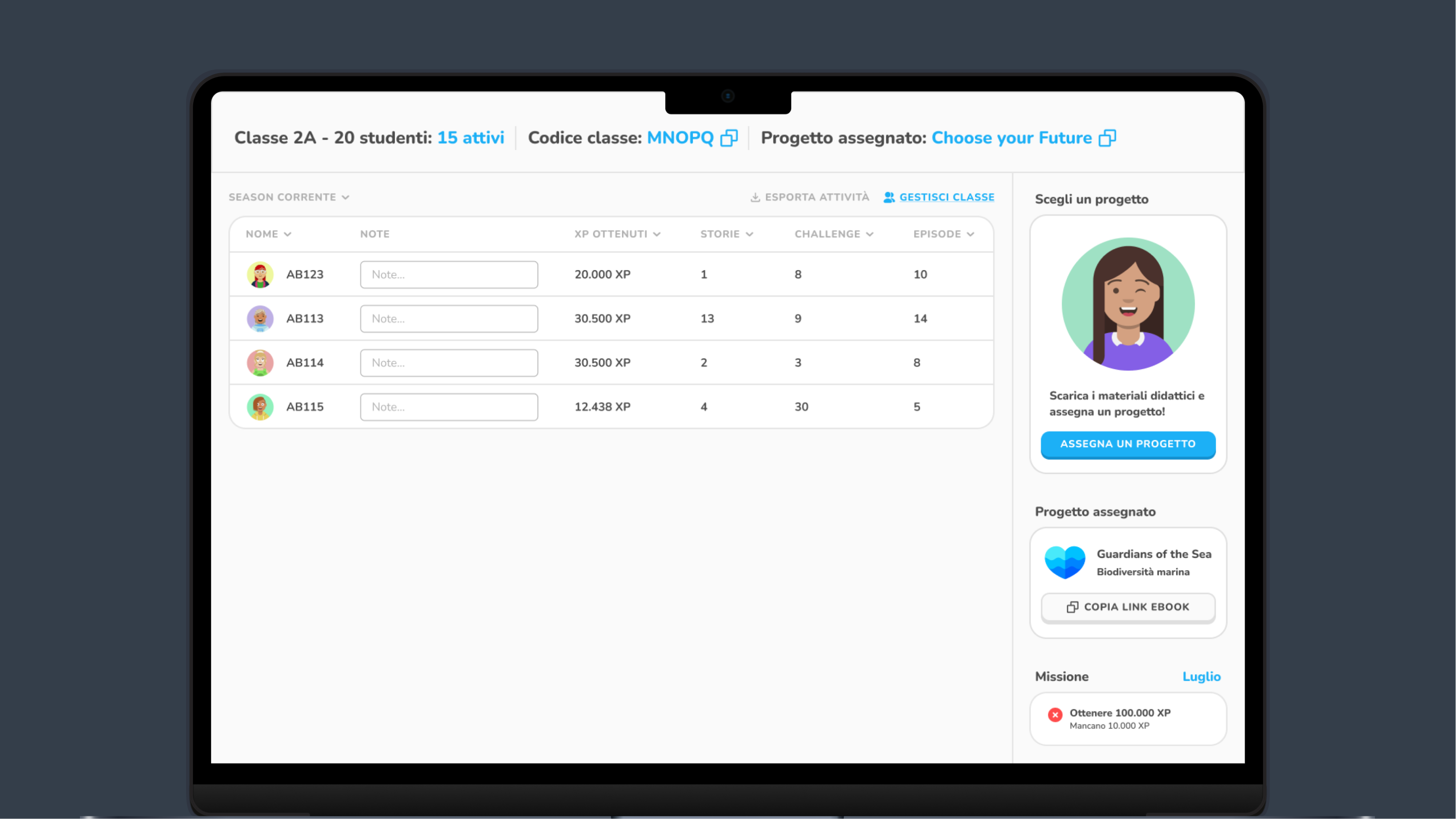
The sidebar shows all classes. Selecting one reveals real-time student data: Daily Challenges completed, Daily Episodes, stories read, plus account management options.
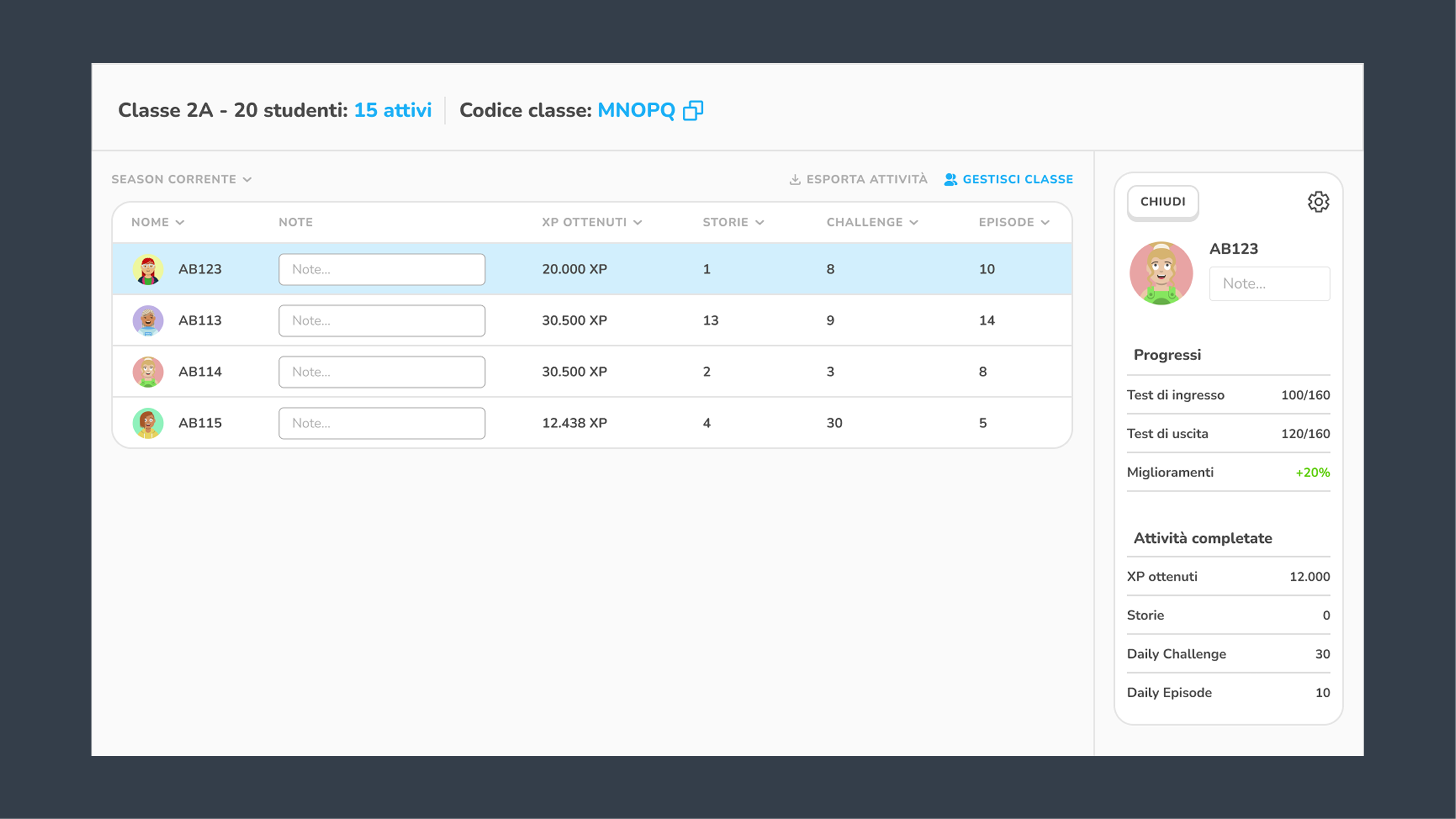
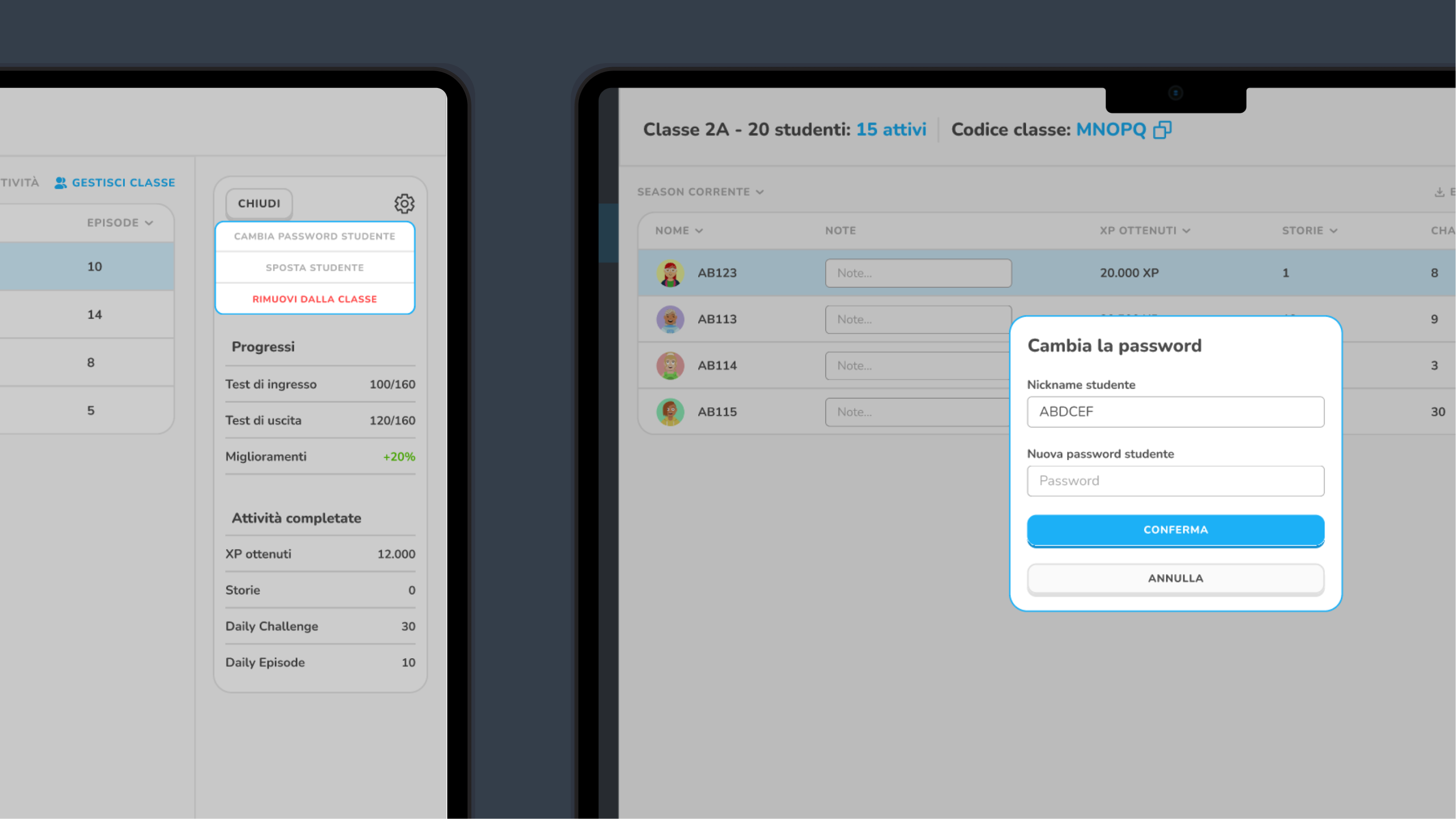
Per-student view with activity breakdown. Teachers can reset passwords, change nicknames, and manage account settings directly - no VIK involvement needed.
The active project is always visible on the dashboard with a direct ebook download link. Teachers never need to remember what's currently assigned or ask VIK for the link.
Before the dashboard, each school required at least one hour of manual VIK team time per week. With dozens of schools, that was the equivalent of a full-time operational role - spent on tasks that should have been self-service. The dashboard didn't just improve the teacher experience. It freed the team to focus on building instead of managing.
About 30% of teachers still contact VIK after setup - not because the tool is broken. Because some teachers want human confirmation even when they've done everything correctly. This is a trust problem, not a UX problem. The next iteration should focus on in-dashboard feedback loops that give teachers confidence their actions have worked.

A dedicated design system and UI kit from day one. That was the biggest friction point throughout the project - building components ad hoc as we went cost more time than the design decisions themselves. I'd also invest more time upfront on flow architecture: thinking through edge cases and multi-class scenarios before touching Figma, not after.
The "Assign a Project" flow. Two clicks to assign a story to every class in the school, with the ebook immediately available. It was my idea, the team pushed back, and teachers thanked us for it. That's the version of the work I want to keep doing - the decision that looks obvious in hindsight but required someone to fight for it first.